When you want to buy any application from the Apple iTunes store you have more choices than you can handle. Most of the users scroll past the application description completely avoiding it like ads displayed on the right column of your webpage. Their choice is dependent on three important factors price, screenshot and reviews.
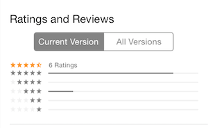
Recently, I have been thinking about how the reviews are displayed in the app store. Apple gives you two choices when viewing reviews as shown below:

The "Current Reviews" section allows the users to view the reviews associated with the current version of the application. While the "All Reviews" section allows the users to view all the reviews for that application.
The problem is with current reviews. Since, current reviews section is dependent on the current version of the app it is reset each time the app is updated. For a lot of apps this will cause a loss of revenue since people stop paying attention once they see no reviews. For this very reason I do not update my app in the peek selling season.
You might be wondering but what about all reviews section which shows everything. Unfortunately, I have experienced that people do not click on all reviews. This is just one extra step users are not willing to take. I have seen few feedback on the apps where the customers complained that they bought the app that had no reviews and wasted their money even though the app had lot of reviews, just not for the current version.
One purpose of the current reviews is to alarm the user of any flaws in the current version of the app. But all of this can easily be accomplished if all reviews section are sorted in descending order.
My proposed solution is to get rid of current reviews and just have all reviews displayed in descending order. This way if there are any problems with the current version of the app than the sorted reviews will reflect it.
What do you think? Reply me at @azamsharp


